A fresh look at Overcast's Now Playing Screen
On episode 384 of the Accidental Tech Podcast Marco Arment, developer of the excellent podcast player Overcast, suggested that some UI changes might be on the horizon for the app. He alluded to the opportunities provided by all the recent changes across Apple's platforms, including Mac Catalyst, SwiftUI, and Apple Silicon. Arment is certainly a thoughtful developer, and Overcast has always had a distinct look, so I wouldn't necessarily expect a drastic redesign. However, this did pique my interest as I've always had a few nitpick-y problems with how the app looks and behaves and I wanted to try my hand at fixing them.
Since its first version Overcast has benefited from a best-in-class feature set. It's clear that Arment has a passion for podcasts and knows what makes for a good listening experience. But the interface, while not bad, has always had the taste of “developer design”. He's followed some UI trends as they've ebbed and flowed, but always kept true to Overcast’s personality. Across the app, things like typography, padding, and margins can be a bit inconsistent, especially when compared to other peer apps. (I don't remember when it was, but I was ecstatic when he added "Use System Font" as an option instead of Concourse – the app's default.)

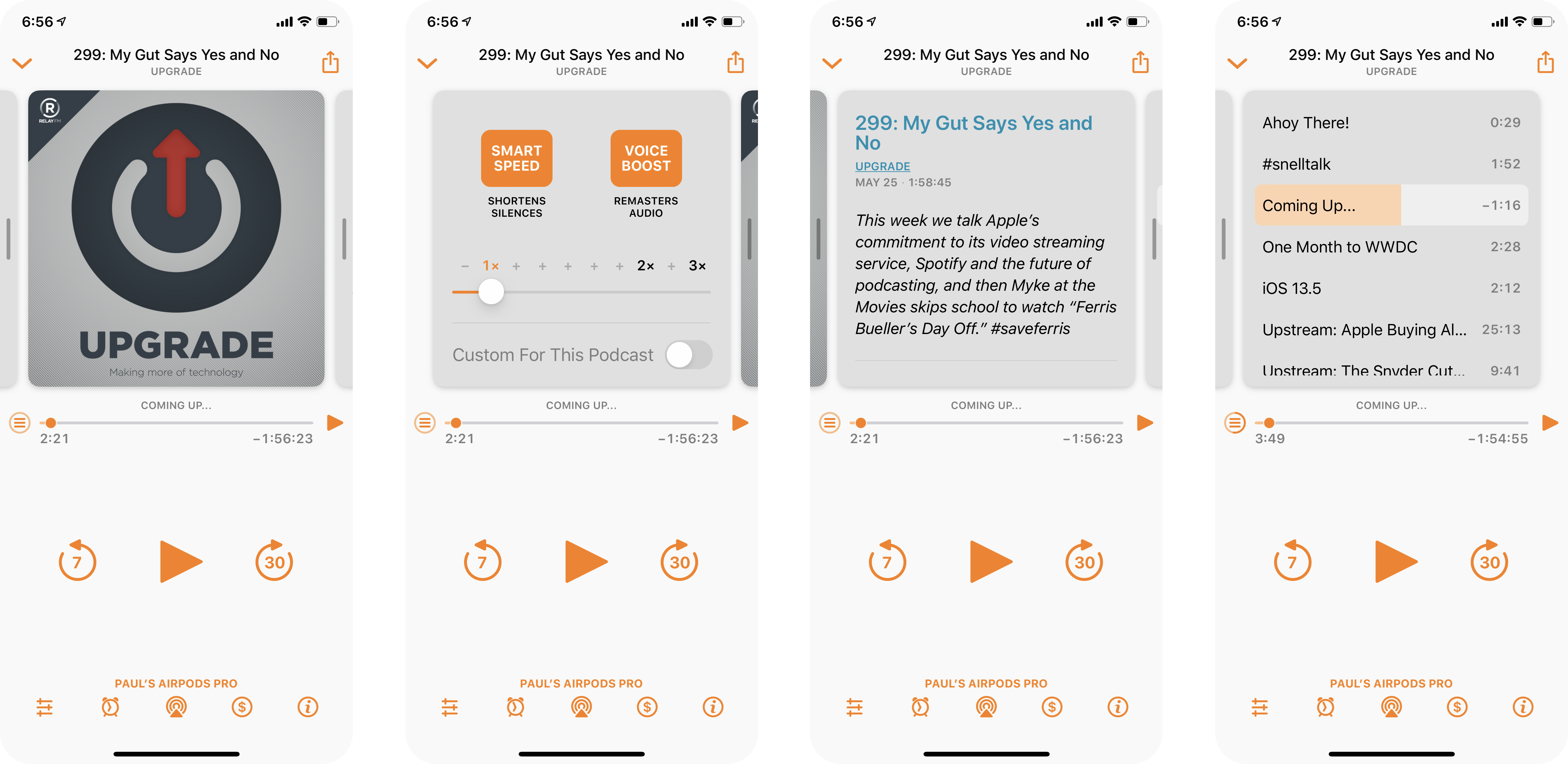
Overcast’s Now Playing screen as of v2020.5. I’ve reordered the pages.
Analysis

While going through the app, I realized it's much larger and more complicated than I would normally give it credit for. The main Podcasts and Playlists pages alone do a lot of heavy lifting, including custom controls like the expanding table row when tapping on an episode. In fact, an area in which I think Arment deserves a lot of praise is how much functionality he fits into the app without needing a traditional app-wide tab bar or hamburger menu.
So with all of that, I decided just to focus on the screen I see the most: Now Playing.
Overcast has slowly added more and more functionality into this screen, and unfortunately I think some of these additions, while good features, have not been well-implemented visually. My central issue is with the paginated panel and the associated buttons for navigating it.
This panel can be swiped (as indicated by grab handles to the left and right of the podcast artwork), or the buttons can be tapped. Unfortunately, the buttons are strewn all over the UI, with no relationship to each other or the pages they take you to. Instead the user is left to discover what they do.
I think there's a valid argument for both the buttons and the swipe gesture. However, the buttons must be repositioned to provide context.
This seems to be an area Arment has struggled with over the years. Previous versions of the app had a vertical scrolling region. Later, he used a version of the classic iOS page dots below the page area - with the settings and show notes dots modified into absurdly small icons.
Proposal
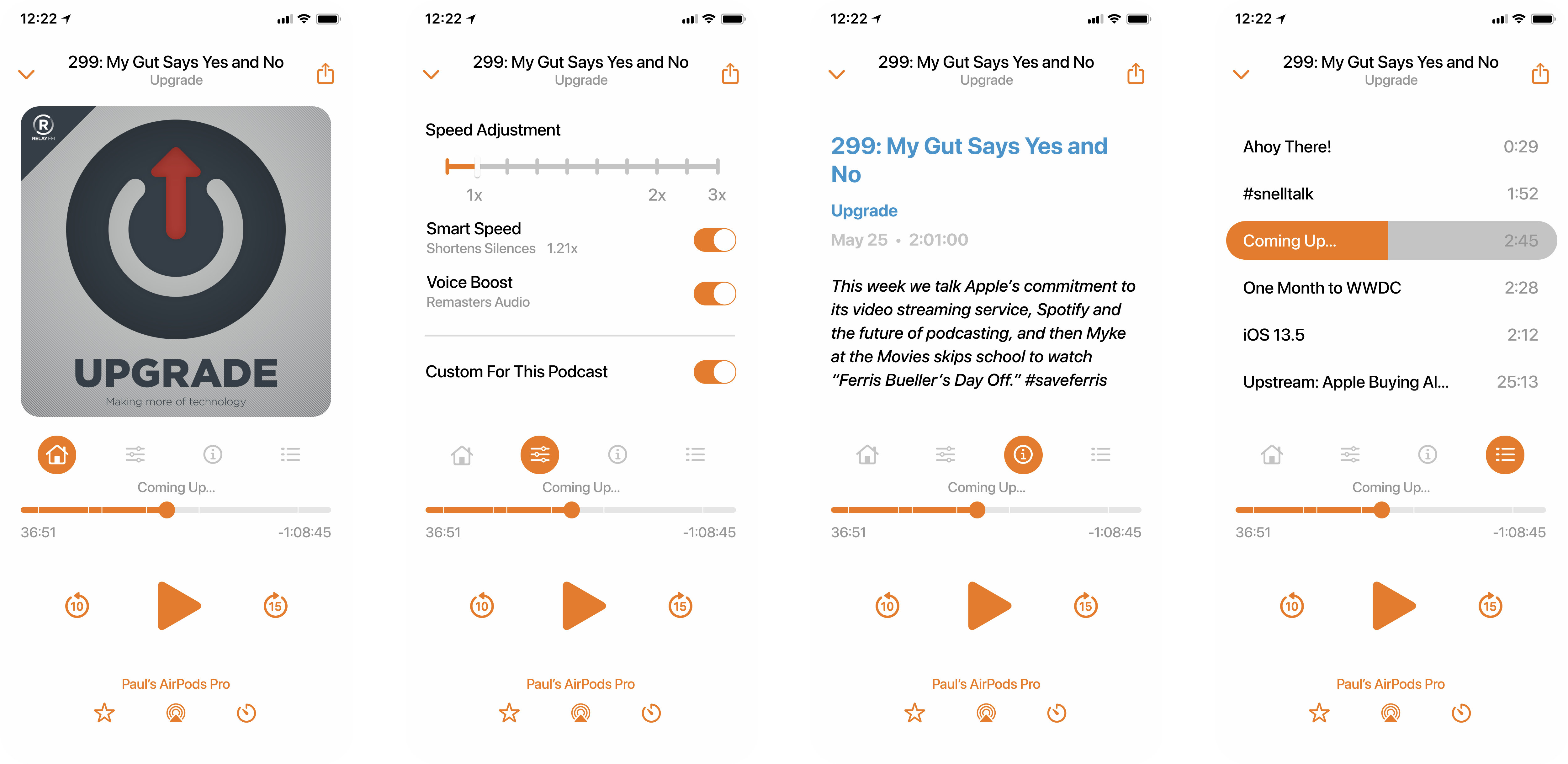
Like I said before, I don't think the app needs or will get a drastic redesign. I tried to focus only on improving the existing experience on the now playing screen.
The first change was to move the buttons for settings, show notes, and chapters. By positioning them below the paginated section, they can now act as navigation indicators, removing the need for the page handles on either side of this section.
For the pages themselves, I removed the gray background of the current version. I don't believe the additional borders, insets, and visual noise are necessary.
I also removed the progress indicator from the chapter button, instead moving that functionality to the main play bar.
In terms of typography, I stuck with San Francisco and tried to reduce the total number of sizes and styles present. Specifically I removed the instances of all caps transformations. I'm not a fan of transforming text against intention. In this case show titles, chapter titles (above the play bar only), and current AirPlay destination. While the latter isn't too important, the first two should be up to the discretion of the podcast publisher. I don't see a compelling reason to change "Upgrade" to "UPGRADE" or "One Month to WWDC" to "ONE MONTH TO WWDC".
I also migrated all glyphs to the latest release of SF Symbols. The only downside here is it prevents the timer icon from showing the current time, a delightful easter egg that Marco claims has been there since day-one.
Finally, I made some small adjustments to the settings, show notes, and chapters page layouts. The goal was to provide consistency across the rest of the app, and remove unique controls where standard ones would suffice. A final side effect of these changes is removing the need for multiple shades of orange and instead settling on a single, signature color.
Conclusion
Of course, these are just one person’s ideas. Which is sort of the beauty of Overcast itself. No design-by-committee. Just design-by-Marco. I’m not sure how many thousands of hours I’ve spent using Overcast since 2014, but regardless of these UI paper cuts, I’m not going to another app anytime soon. Here’s to a few thousand more.